Case study 05 / 06
Bridging Health Equity
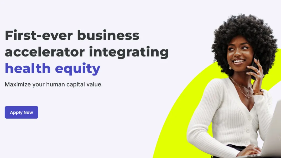
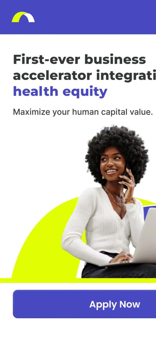
Affordable, jargon-free healthcare plans for women- and minority-owned businesses, designed with DiscoverU Health.
- Role
- UX Researcher & UX Designer
- Partner
- DiscoverU Health
- Results
- +40% sign-ups · 85% satisfaction
At a glance
The problem
Finding affordable, customized healthcare is hard for women and minority business owners: plans are unrealistically priced, full of jargon, and short on options.
The approach
Working with a team, I owned the research, led usability testing, and created the wireframes and prototypes. Together we focused on easier plan comparison and tooltips that decode healthcare jargon.
The outcome
Testing showed a 40% increase in sign-ups, and the platform received an 85% satisfaction score in usability tests, with users highlighting its simplicity and inclusivity.
Key results
- +40%increase in sign-ups shown in testing
- 85%satisfaction score in usability tests
- 10interviews and surveys with women and minority business owners
- 5target users in remote usability testing
Overview
BHE starts from a simple premise: healthcare platforms overlook women and minority business owners, so BHE is designed around them.
Bridging Health Equity (BHE) makes healthcare more accessible to women and minority-owned businesses and better tailored to their needs. It tackles affordability, complexity, and a lack of inclusivity to give underrepresented communities personalized healthcare.
Problem Statement
Women and minority business owners often face unique challenges getting affordable, customized healthcare. Existing platforms aren’t designed with them in mind and often come with:
- Unrealistic price plans
- Jargon-heavy content
- Limited options
Target Audience
BHE’s primary users are women and minority business owners looking for affordable, accessible plans for their employees, their families, and themselves. They value clarity, simplicity, and inclusivity.
My Role
UX Researcher and UX Designer, working closely with developers and healthcare experts.
- Owned: user research and competitive analysis
- Developed: personas and journey maps
- Created: wireframes and prototypes
- Led: usability testing
Research
Cost was only part of the problem. Users also struggled to make sense of healthcare itself.
Understanding the User
The sticking points: complex healthcare terminology and comparing plans. Many wanted a platform that was simple, transparent, and visually inclusive.
I found these through 10 interviews and surveys with women and minority business owners. Stakeholder interviews with healthcare experts deepened our understanding of the challenges users face.
I also ran a competitive analysis of competitors’ information, layouts, and design elements to find shortcomings we could improve on.
Personas & Journey Maps
Journey maps surfaced critical frustrations like confusion about plan eligibility and difficulty navigating existing platforms.
The maps trace the experiences of personas I developed, such as Maria, a Latina entrepreneur seeking affordable family healthcare, and James, an African American startup owner focused on employee wellness.
Design
A core challenge ran through the design: making complex plan information simpler without making it less informative.
Ideation
The team brainstormed features against user pain points, then narrowed in on a streamlined plan comparison tool and tooltips that simplify healthcare jargon.
Wireframes
Low-fidelity wireframes set the basic layout and navigation structure. The high-fidelity versions added:
- A modern aesthetic
- Accessible typography
- Clear call-to-action buttons
- Visuals that represent a diverse user base
High-Fidelity Design
Usability Testing
Testing showed the research problems weren’t fully solved: participants got confused switching between plan comparisons, and healthcare jargon slowed them down.
Findings & Fixes
- Navigation: The flow was confusing, especially when switching between plan comparisons. We restructured the navigation and added breadcrumb trails to keep users oriented.
- Terminology: Healthcare jargon slowed many participants down and frustrated them. We added tooltips and a glossary.
- Visual hierarchy: Important information wasn’t prioritized, so content was hard to scan and digest. We updated color contrast, font sizes, and spacing to improve readability and accessibility.
Test Setup
I led remote usability testing with 5 target users. They compared healthcare plans, navigated to bilingual support options, and signed up for an account. Observations focused on pain points, ease of navigation, and overall satisfaction.
Outcome
Simplicity and inclusivity were what many users wanted from the start, and in the end, they’re what users highlighted in usability tests.
Results
- Testing showed a 40% increase in sign-ups.
- The platform received an 85% satisfaction score in usability tests.
- Users highlighted its simplicity and inclusivity.
Challenges & Lessons
A core challenge was simplifying complex plan information while keeping it informative. Breaking it into digestible pieces and adding interactive features like tooltips helped us strike that balance.
Testing underscored the value of user feedback, and the project reinforced the importance of empathy and iteration. I learned that designing for underserved groups takes ongoing collaboration, listening, and adaptability.
Conclusion
BHE shows how user-centered design can help address social inequities. It put my research, design, and testing skills to work on a critical issue.